
Brands, like websites, are most effective when they’re not allowed to be static. Brands — and their graphic marks, in particular — shouldn’t be as dynamic as websites, of course; that is, unlike the constantly evolving content of websites, graphic marks need time to root in the collective consciousness of the target audience. Nevertheless, they do need to remain fresh, contemporary, and reflective of change within their respective environments.
We’ve seen the graphic marks of many successful brands — Shell Oil, Nike, Pepsi, Apple et al. — evolve with taste and class, in ways that didn’t alienate their constituencies, leave the designers of their marks open to questions about their marbles, or open the brands to questions about direction, quality, or integrity. On the other side of the coin, here’s a hypothetical antithesis:
In more innocent days, the Wendy’s mark reflected the desire of its founder, that quintessential regular joe, Dave Thomas, to reflect the company’s namesake: Dave’s daughter, Wendy. So, we had the freckled, virginal redhead, whose pigtails stood out at horizontal right angles from her head, with a paean to the quality of Wendy’s product semi-circling her head like a halo (as reflected in the 1969-1977 versions here).
By 2007, it was a given that Wendy’s was a run-of-the-mill fast-food joint, so Old Fashioned Hamburgers was nuked. Wendy’s hair was a little redder. Only the collar of the dress was shown, eliminating the puffed shoulders of the original rendering. And Wendy’s pigtails were allowed to be every so slightly more susceptible to gravity. The effect was one of noticeable change, no rocked boats, and enough familiarity to keep us in the park.
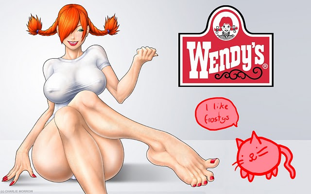
But given the iteration above, Wendy’s inhibitions appear to have gone to that Big Grill in the Sky with old Dave. Her hair is still red. Her pigtails still defy gravity. But the demure parting of her hair in the middle of her head has been replaced by a rakish angling of her forelocks over her right eye. The dress is gone, replaced by some sort of spandex t-shirt that taxes the imagination not at all and seems to be the sum total of her outfit.
She’s undergone a breast augmentation that might have shifted her center of gravity perilously, were it not for the breathtaking curvature of her ample bottom, which, no doubt, provides suitable ballast for her carriage. The image isn’t likely to leave prospective customers — at least not those of the male variety — thinking of fast food first, unless it’s to evoke the age-old question: Do I get fries with that shake?
This may be a cruel hoax, with cruel subject to definition and interpretation. But its lesson abides: Changing your graphic mark to reflect a change in your brand, its positioning, and its target audience is one thing. Boldness unto bad taste is quite another, especially if it constitutes sensationalism for its own sake. Since brands do, in fact, engender emotional connections, it’s best to respect those emotions — or at least appeal to the least base of those on the list.
Rule of thumb: When contemplating options for the overhaul of your graphic mark — especially since it’s a primary reflection of the brand you’ve worked so hard to establish and position — if it looks like overkill, it’s overkill.
While you’re trying to decide, enjoy your meal.
—
Image courtesy of, and all rights belong to, Charlie Morrow.